All of the posters that I could find online are posters for national newspapers that are sold country wide.
 This poster advertises '6 new sections' of the newspaper 'The Times'. It displays both what is it offers readers, therefore establishing a target market; it has 'The Saturday Review', a magazine (this one has a photograph of Amy Winehouse - this could be representing a music magazine), a magazine for the weekend and only what I can assume to be a sports magazine as it has a page of a photograph of a cricket player. The Times has a fairly well known slogan: "Only In The Times"; this tells readers that The Times is an individual newspaper, and the only newspaper that offers these 6 new sections. It also has the times logo in white in the top right corner, so the readers know that 'The Saturday' is part of The Times.
 This poster is advertises The Daily Telegraph. The name of the paper is written in a fairly medieval font. Its slogan is 'It pays to think big.' with three pictures with small but strong statements about three incredibly famous personalities (John Lennon, Andy Warhol and Bill Clinton) it what their parents jobs were, this shows the readers and audience that they can have faith and hope in themselves and what they want to achieve; giving readers confidence and faith in the newspaper. The photographs are bright and bold and they stand out from the plain white background and (in comparison) the small black font, the name of the paper is also bolder and larger than the slogan and the small statements beneath each photograph. The photographs are fairly central to the whole poster, which initially draw the attention to the poster, then the attention is drawn to title of the newspaper and it's slogan.
 This poster advertises the Sunday Times, it's slogan is 'For all you are.'. The background of the poster is grey and white and the font is inverted white on grey or visa versa. The only colour on the poster is used on the images of the sections that the newspaper includes, these link to the heading of the poster; 'There's a part of you for every part of The Sunday Times.' The reader/audience is now aware that The Sunday Times have a variation of topics in the paper, this interests the readers/audience into the newspaper because they are persuaded to beleive by the heading and the slogan that there is something for them to read that will be of their interest.
This poster is for The Sun newspaper, it is a photograph of a receipt. This receipt has a list of thirteen things that The Sun includes inside. This poster is quite different to the other posters that I have looked at, because it shows a variation of things, from 'Mystic Meg' (horoscopes) to "£9.50 Holidays" aswell as the typical sections like 'Politics'. This poster, also unlike others that I have looked at shows the price of the paper; 30 pence. Because of the receipt being in a list format, the readers are attracted to the top of the list first, therefore reading through the list and finding out what the sun includes, then the font increases in size and it reads 'TOTAL 30P'. This is then followed by the only coloured item on the receipt, which is the logo/name of the paper; 'The Sun'.
Because of the name of the paper being the only coloured item on the whole poster, it emphasizes it's indivuality. After this, the price if repeated, emphasizing to the reader/audience that the paper is cheap, but interesting and of good quality; 'All for just 30p'

This poster, as it states, advertises 'The Times'.
This is a very different poster compared to the others that I have looked at, as it doesn't particularly focus on the paper and the variation that it may include. The photograph is of a shark being caught in a fishing net, and it has become entangled in it. This links to the small paragraph beneath the title of the paper:
"On current forecasts, the world will run out of seafood in 41 years.
Only The Times has an ocean correspondent. If you care about the world we live in, the 70% of it that is covered by water is also covered by us.
Be part of The Times" Having a unique poster like this, gives the newspaper an idea of it being unique and it shows the reader that they have a specialist in topics to do with the sea and topics surrounding it. This leads readers to beleive that 'The Times' may also have specialists in other topics, therefore being a very reliable source of information that is true. It also uses what could be considered as emotional blackmail, by using a photograph of a shark being caught and struggling in a fishing net. It also bluntly reads that the earth will run out of seafood, followed by a short, punchy sentence. The "emotional blackmail" is so subtle that it isn't seen as an annoying nag, like some television adverts are (that advertise similar issues). The poster also includes an interesting fact about the world & the sea, this interests and intreegues readers into what the newspaper can offer them and hints at how much information they could gain from reading. 'The Times' is spread across the fin of the shark, this centres the shark, and then draws us to acknowledge what the poster is about, but the title is also brought to the main focus of the poster because it is so bold and in white, capital font. Lastly, the final sentence on the poster reads 'Be part of The Times.'; this is a short punchy sentence that has some form of persuasive technique that makes the reader feel a part of 'The Times', even though they have only been told that they should be and they have only come across a small piece of information.

This poster is for the Guardian newspaper's website. It's a fairly simple design. A plain white background with multi-coloured wiggled lines that are attatched to simple grey computer mice attatched to the ends. 'theguardian' is written in the format of one word, 'Guardian' is written in bold, navy compared to 'the' and '.co.uk' in a pale grey colour. This is at the top right corner and the other text and information is linked to a pink cable. The text at the bottom says:
'Listening to lots of different views
rather than just one
means you can decide for yourself
instead of just being told what to think.
Don't you agree?
You don't have to ofcourse.'
This involves the reader with the use of 'you', twice along with the rhetorical question. It is also in a fairly conversational tone, this is some what comfortable and relaxing. The text is also in various colours. The image of the corded computer mice is almost in a spherical shape. With one cord trailing off on it's own. This draws the attention straight to the text. The poster states a message about there being various views in the stories/website, this is also highlighted by the various colours, especially on the text. This also shows the readers that there is no specific aim of the paper; it has stories for "everyone".
 This poster is also for The Guardian website. It has many similar attributes as the poster above. The name of the website is set out in the same way, and it still has the multi-coloured corded computer mice. All the cords are initially joint to the slogan at the bottom. The mice are spread out, but they all end up in the direction of 'theguardian.co.uk', therefore drawing attention to the name of the paper/website. This method is also used to draw attention to the slogan; 'Listen to many. Decide for yourself.' Similarly to the poster above, the reader is involved by the word 'yourself'. This slogan is also telling the reader that there is a variation of ideas and articles. Therefore again, catering for "everyone's" needs.
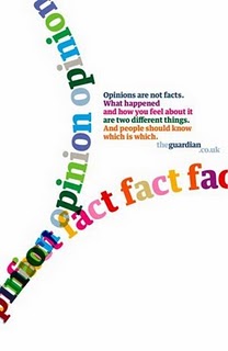 This poster, on the left, is again a poster for The Guardian's website. Unlike the other two posters, this one does not use the multi-coloured corded mice. Instead, it has 'opinion' and 'fact' repeated in a curved line in a variation of colours. The way that these words are set out and curved into a V shape, puts more emphasis on the small paragraph of text and 'theguardian.co.uk'. The small paragraph reads:
'Opinions are not facts.
What happened
and how you feel about it
are two different things.
And people should know
which is which. '
As with the other Guardian posters, with a few words on each line, the new line adds a break inbetween them. This adds emphasis to each line.
The use of the large font reading 'opinion' and 'fact' shows the reader that they have both, and it allows the reader to be a part of the stories if they want to.
Through out researching into posters for newspapers, I have struggled to use any posters that are created for a local newspaper by searching online. So to try and help my research, I am going to try and find posters for newspapers around where I live, for example in shops, newsagents, post offices and other places where newspapers are sold or even where they are written, for example, on the high street in Haverhill, there is a building designated for 'The Haverhill Echo', as does Halstead, with 'The Halstead Gazette'.
These are the conventions that I have found through out these posters.
- 1 main image
- Not alot of text
- Eyecatching
- Involves the newspaper website
- The general tone is serious
- Features the name of the newspaper with its logo
- The advert tells you what is unique about the newspaper
- They aren't gender or age specific
- They include prounouns to involve the audience
- 'Value for money' is a technique used to sell the newspaper
No comments:
Post a Comment