In choosing the name of my website , I have chosen 'TheEssexHeart.moonfruit.com', as it is the chosen name of my paper.

When creating the menu bar of links at the top, I added the name of every page that I have chosen to display on the homepage of my website. I have chosen (other than the homepage itself) to have 'Local News', 'National News', 'Sport', 'Leisure', 'Your Voice', 'Contact Us', 'Jobs', 'Vehicles' and 'Login Register'. The two pages that I am going to create hyperlinks to are 'Local News' and 'Sport'. I have chosen these two pages because I feel that I will be able to use a wide range of skills in what I create through out the pages, for example on the 'Local News' page, I will be able to display photographs along with their stories, and I will also be able to write interviews with people and create a suiting layout for the page so that the information and the photographs are well set out and in the best positiion for a reader to understand the articles on the page. This is what the menu bar looks like at the top of the homepage and how I created it:
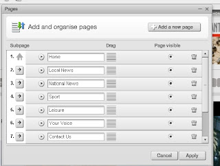
The printscreens above and below are after I had created all ten of the pages and displayed them on the menu bar, present on every page in exactly the same position.

This printscreen is proof of the hover/select method working on the menu bar:

 I have also hyper-linked this advert to the website of 'Advantage Environmental', as all of the adverts on the websites that I have looked at link to the page that they are advertising.
This is what the search bar looks like:

ress to use for my website. I have decided to use teh@nqe.uk, the 'teh' standing for The Essex Heart. The number that I have chosen to use for texts is simply a 5 digit 87766. The websites that I have found with similar text message numbers are the Halstead Gazette with the number of 80360.
The next 3 images are images that I have created for my website (I used a program called GIMP to create them):
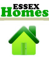
1. This image is for a page that would show the houses that are for sale in Essex. I chose to use the same font for this image as I have for the name of the paper. I have also decided to use a different colour for all of the images that would be a link to another page. This way they are easily identified by an individual colour.
2. This image would be a link to a page that had a list of events that are/were coming up in the current month. I felt that an icon of a balloon would be fairly appropriate as it covers a wide range of events that could be held.

3. This image would link to a page where jobs are listed under alphabeticalised areas in Essex.I chose to create a simple icon that links to the colour of the page. I felt that this would be appropriate for the page.

The three images below are adverts that I have created for my website (all created on GIMP):

 On the websites that I have seen, they often advertise some form of job, usually a job searcher website. Therefore, I decided to create an advert for a job site. I came across totaljobs.com, and decided to create an advert for it. I printscreened the name of the website from it's homepage. I then pasted and cropped this into GIMP. I then filled the botom with the same colour as the rest of the the name and added & rotated the other text.
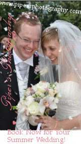
For the advert above, I used a photograph that I took at my cousins wedding in July. I cropped this photo and added the text. I was inspired to make this advert because of other adverts for events like wedding fairs being advertised on websites. Both of the adverts above appear on my homepage, and the total jobs advert also appears on my local news page.

Similarly to how I created the total jobs advert, I printscreened the name of the company from it's homepage then pasted it into GIMP and added the rest of the text. I have seen numerous websites advertised like this on newspaper websites, aswell as many other websites, so I felt it wouldn't ruin the realistic feel of the website to create an advert that advertised a website like find a property.com.

At the bottom of all of the websites I looked at were small buttons with links to the most important pages. I decided to do this on my website so that it was as close to a newspaper website as I could get. Above I have printscreened what I had to do to create these buttons, and below is the result of how I present the buttons at the bottom of all my webpages. In the printscreen below, I have also added social book marks. On various websites, not just newspaper websites, I have come across these bookmarks that allow the reader to 'follow' them on Facebook or Twitter for example. I felt that this would broaden the target audience as it tends to be younger people who use 
The same image that shows what I had to select to create the link buttons also shows the option of making a HTML snippet. I used three HTML snippets on my home page. I found a useful websites where I could get various HTMLs. I got my date HTML from a website called timeanddate.com, there were various different clocks that I could use, but I felt it would look more proffessional and suit the style of my website more if I had the date in written format. I decided to put this just beneath 'The Essex Heart' on my menu bar, so it appears on every page. Shown below:

I also felt that it would be a good idea if I were to create a section dedicated to the weather forecast of the next few days. I had seen this on the BBC website and decided that it would look more professional if I weer to add this weather forecast. I got the HTML link from the Met office. I felt that the met office would show a reliable weather forecast. The down side to this HMTL link was that I could only choose one area. I therefore chose Colchester, as it is a fairly big area in Essex. If this box is clicked on, the reader is re-directed to the met office website
 The third HTML code that I used was for a marquee. On other websites that I have come across, in particular news websites, they have a constanlty updated marquee beneath the 'Latest headlines' title. I couldn't find any marquees that enabled me to change what was written, so I have to have the same sentence going round the whole time. I decided to make the marquee about top stories of the month. I have shown this in the printscreen below.
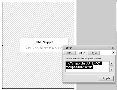
 Below, I have shown how I created the HTML boxes:
I had to copy and paste the link into the setup box, then apply it and then stretching the stripey HTML edit box so that it was the right size. To view the HTML I had to 'view my page'
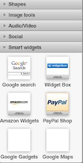
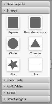
Behind a lot of the things I'm adding to my website, I'll put a box behind them so that they stand out. The shapes can be added using the tool box, shown below. There are a variation of shapes to use, but for the most proffessional effect I am going to use just the square and the rounded square. Even thought it says that they are squares, it is possible to change to a rectangle so in most cases I will.
 On my website, I decided to stick to two main fonts: Ariel and Rockwell Light. I chose to use Ariel for the body text because it is easy to use. I stuck to a reasonable sized font through out my stories. I chose to have Rockwell Light as my Title font because it stood out from the rest of the text and it is also easy to read.
On all of the newspaper websites that I looked at there was a section dedicated to the most read and most commented/popular stories. I created this below. To make it stand out, I wrote 'most read' in capitals. To allow myself to have more stories, I made the text box too small so that the reader would have to scroll to look through all of the headlines, and less space is being used.
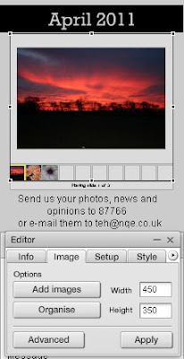
 I felt that it would show more creativity if I added photographs to the webpage that weren't necessarily related to the articles surrounding them. The Suffolk Free Press inspired me to do this. They had an image slideshow of images that readers had sent in.
there are many options below on how to display photographs. I chose the slide show one because it looks more professional and suitable for a newspaper website as the others are for more creative and artistic purposes.
To add images I have to go through the same process shown above. 'Add image' and then apply. I have added my own photographs that I have taken in the past. I will add more so that the empty boxes beneath the biggest photograph are filled. I have chosen to apply 'April 2011' above this because I felt that if I base the website in April, it will be closer to the marking date. Above this I have written Your photos of Essex. this draws readers in because of the large font, and the use of 'you'.
Looking at E-mailing photos in, I felt that I had to make it obvious in how to mail photographs in to the newspaper so that we could publish them on the website. I created my e-mail address teh@nqe.co.uk. I chose this because teh is an abreviation of The Essex Heart. And looking at other email addresses were 'nqe'. I reserached into this and discovered that nqe stood for News Quest Essex. Here is what their website says about who they are:
"Newsquest (Essex) Ltd is the leading publisher of regional newspapers in Essex - publishing a total of sixteen newspapers including daily, paid and free weekly titles. In addition to newspapers we also publish a whole host of other publications from targeted monthly lifestyle magazines to other community led products."
I felt to create a realistic email address, rather than using something like hotmail, I could use this. I also added this 'Contact Us' box. This allows the reader to easily send a question or any information to the newspaper. 
This is how I upload photographs:
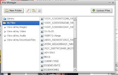
Initially I have to upload photos to this file box, I then add them to the page or the slide show.
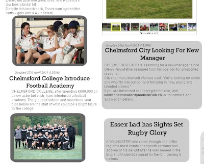
 Above, is the articles on my homepage. I felt that I should have made these articles stand out than all of the others, So I gave all three photographs and put both photograph and text into a rounded square. All of the stories that I looked at on other websites that I looked at had the date and time shown just above or below the article. I chose to add this above the headline, in a smaller italic font so that attention was drawn to the headline still rather than the time and date that it was updated or written. I chose that there was not enough room to write the whole story on the home page of the website, so I wrote the beginning, just how I have seen on other websites and then beneath this, a link that says 'read more...' This makes sure that the reader knows that that is not the whole story, and they do not have very much information to read before they know whether they'll be interested in the story.
Initially, I had started to use Piczo.com to design and create my website, but after it becoming apparent to me that Piczo.com is too unprofessional for the standards that I want to create a website for my newspaper, I am now using Moonfruit.com as I can create a website with the professional standards that I want and that can create a professional outlook like those I have researched. In creating my website, I had to choose what layout I wanted to use for the home page (I can change the layout for my hyperlinked pages when I create them). So I chose the 'Blank Page' option so that I could create the page exactly how I want it to look like.


No comments:
Post a Comment