Although the newspaper seems to have a target market of the retired or the unemployed, having a website appeals to the younger generation. The wesbite seems to have a recurring colour scheme, blue/grey/teal & red. Red, being the recognisable colour of the newspaper, contrasts with the blues & teals of the links and headings on parts of the site. The website also includes date and time, I was considering using this in my website as it would be helpful to the readers.


The Halstead Gazette homepage:
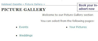
An identicle logo at the top of the home page to what is on the top of the actual newspaper. The tabs from this website that have influenced my decision on what my two hyperlinked tabs would be Leisure, sport & the photo gallery. Although having a photograph gallery wouldn't be a very successful newspaper website, as it doesn't include much writing, only descriptions of the photographs taken. The title of the page is written in bold capitals, similar to other sections and pages of the website, which specifies a section and individually draws the attention to the page or section. This section also allows the readers to add in their own photos and practially be a part of what they see in their newspaper/ on the website.
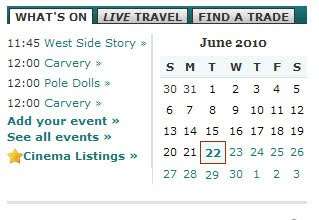
 This calender is on the home page, it shows events happening through out the month in the local area, similar to how the front page of the news paper conveys a target audience, showing specific events on their website that would appeal to their target market in the same way the adverts do in the newspaper.
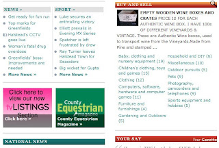
 The printscreen above widens the choice and target market of the newspaper. This section is at the very bottom of the Halstead Gazette's homepage. It highlights a younger adult target audience as it offers jobs, dating oppurtunities, home and cars. Although this could also be aimed at an older audience who are searching for new jobs, homes and cars.
The section above shows more sections of the website that convey a wider target audience, showing links leading to a sports page. It also links to a page/section where the readers can buy and sell unwanted items. There are also two sections and links to 'National News' and 'Your Say'. National News allows readers to widen their knowledge on what is happening around the world aswell as in their local area. The Your Say section allows readers to talk about their views and opinions on stories and what is happening. Having the headings in different coloured frames highlights the differences in the sections and equally attracts attention to each section. This almost ensures that each section is looked at, which in turn helps people who are perhaps looking for something in particular, to find it. Adverts are used here aswell as other sections of the website, to advertise other sections of their own website, for example television listings, which covers another section of media, which also introduces more range and variation in the audience/target market.

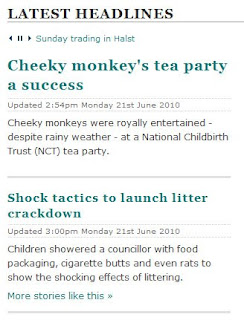
The print screen above demonstrates the most recent top headlines in the newspaper. It gives the reader a small, interesting opening of the story to intrigue them into reading more, or even more stories like that. Having the headlines in a contrasting blue/teal font draws attention to each headline and link. Having the title 'Latest Headlines' in bold capitals, similarly draws attention to this specific section of the webpage. Just below this title, it has sentances of information scrolling across the page, which individually draws the reader toward this section.
No comments:
Post a Comment