Wednesday, 30 June 2010
After Looking at Websites...
BBC Essex is one of the most unique news website, as it has numerous sections dedicated to listening, watching and reading. This website also has a weather forecast for the area. I would like to recreate this for my website.
Local paper websites made me realise that there are often many adverts, pictures and photographs, especially on the homepage. This is what I would also like to recreate on my website. Many websites, for example the Halstead Gazette, have small marquees at the top of the web page that have the most updated news stories that readers are able to click on and read the stories. After looking into how to recreate this on my website, I have found various places where I can copy and paste a HTML link so that I can create a marquee on my website. But this marquee can not be updated, it can only be a constant stream of the same words over and over, so I could make it look like a link to a page, and tell the readers to click on this to take them to a certain page, for example the month's top stories.
Overall, I feel that it would be more unique to recreate some of the things that I have seen on other news websites. But to create a realistic newspaper website, I would need to limit these aspects to a point where it would be realistic to see them on a newspaper website.
Looking into Other News: Thisistotalessex
 This is Total Essex tends to get it's stories from newspaper websites in Essex. It seems to colaberate all of the top stories and put them onto it's own website. The prinscreen above is the main menu, which is located at the top of the page. It has the main links written in grey on a white background, and then beneath each, when hovered over, appears a grey box with white writing that includes sub links related to the topic that is being hovered over. There is also an option to 'login/register', along with a search bar, a brief weather forecast and various hyperlinked logos to their website.
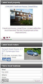
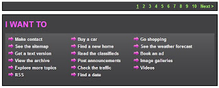
The printscreen above shows a section on the page that is located toward the bottom of the page. It allows the reader to view what the website offers in one section. this makes searching for something a lot easier as it will take the reader to where they want to go in one click.
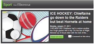 This printscreen is an example of the different parts of the website. This shows that there is a page for sports, and this is shown on the home page that takes you to the sports page, and to continue reading the article that is written on the right side of the picture. The picture makes it obvious that it leads to the sports page, along with the heading.
Tuesday, 29 June 2010
Looking into Other News: Google

'Google news' has the same logo as the general search engine 'Google', it is even initially set out in the same way as the Google search engine home page is, like the printscreen above.
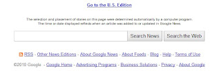
The printscreen to the left is of the search engine tool bar at the bottom of the page, there is also an option to go the the 'U.S Edition', to find out news that is going on in the USA, there are also links to other pages that Google offer, for example pages that include information about Google in particular.

The page includes many different heading of different types of news, this includes Business, Sci/Tech, U.K, World and Local News, all shown in the printscreens on the left and below.
All of the dedicated sections have two small images that both of the stories are linked to,this gives the reader a better insight of the story and perhaps adds
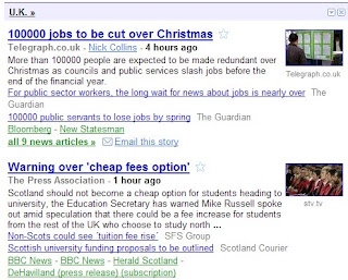 a higher level of interest to each story. The heading on each section is also a link, this allows the reader to read more articles about which ever subject they are interested in.
There is also an option to minimize or close a section, so if the reader is not interested in a specific topic, they can get rid of or hide it. This is done by selecting either the small arrow in a box or the small cross in a box in the top right of each section.
Beneath each article heading, there is the name of the website that the piece of news was received from, this is in pale grey writing, so that it doesn't take any attention away from the bold navy
 headline. Some of the articles also have the names of the people who wrote the story in underlined grey font. The amount of time ago that the story was added to the page is also present on each story, along the same line that the name of the website that the article belongs to.
Beneath this, the first five or so lines of the article are shown, this gives readers the opportunity to decide whether or not the story interests them.
There is also a link to a story that is similar to the one that is previewed, also with the name of the website that initially had it. There is also a small list of other websites that have reported the same or a similar story.
 This section is a search tool bar, the reader types in the name of the place where they live or their post code, and it comes up with a section, presented like the rest, of articles that are based in their local area.
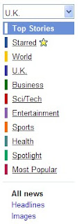
This section is on the left side of the page, toward the middle/bottom of the page, it has a list of all the different sections and types of stories that the website includes, these are also all spread out across the page, as shown in the printscreens above. It is also possible to click a link that shows the reader all of the latest headlines, and another link that allows the reader to view all of the photographs & images related to the articles.
Monday, 28 June 2010
Looking into Other News: NewsNow

 and the name of each section is written in white, this draws attention to the this highlights each type of articlessection individually.
Each section has four headlines included, and these headlines have a small flag to the left side of them, this allows the reader to know which country the affects/is based in, all of the stories on
 the home page are either based in the USA or the UK.
Each of the sections have a link that allows the reader to read stories that are also related to the genre; 'more'. All of these stories on each section have the name of the paper that initially wrote the story, and then it is followed by the time is was added to the website. This is in light grey writing, compared to the black headline writing, the headline is drawn out.
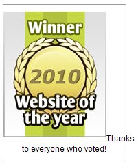
NewsNow has an image on the left side of the home page toward the middle of the page, this is one of the brightest images on the page, and it tells the reader that they have been nominated and won the "Website of the year", this gives the readers confidence in the website. Beneath, it also reads "Thanks to everyone who voted!" this gives the reader a feeling of involvement toward the website.
Sunday, 27 June 2010
Looking into Other News: BBC
 This is the main menu bar at the top of the page. It has seperate links for news, sport, weather, iPlayer, TV, radio and more. The colours through out the website, not just Essex, are red, white and black/grey. There is also an option to listen to the radio live online.
 The page is set out into various sections. At the top of the page, shown in the printscreen above are the most recently updated or added articles, along with headlines of 'other top local stories', and 'local sports headlines'. This section also offers a story within a video. Thre are three photographs in this section, therefore it isn't overcrowded with pictures and there is also not too much text. The headlines and other links are in blue, making them stand out and making it obvious that they are links that lead you elsewhere.
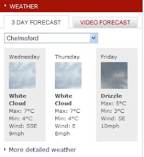 As shown above, there is a three day weather forecast, and it is possible to select the area of Essex that you live in with a drop down menu. There is also a second option to watch a video forecast. At the bottom of this section is a link to see 'more detailed weather.'
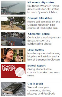
The section that I have printscreened above is located down the left side of the website. This offers readers more information and there is a selected amount of links that include getting in touch with BBC Essex, looking at school reports, local events and various news articles. Each article and other information link has a small description next to the photograph/image. This allows the reader to know whether there is a link that they are looking for or interested in without having to click on the link and look through the more detailed information. The pictures draw attention to this part of the web page.
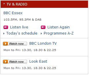 Similar to what is at the top of the web page, there is a whole section dedicated to listening to the radio and watching videos. There is a choice of 'listening live' or to 'listen again' along with the schedule and the list of programmes in alphabetical order. Beneath this, are two more sections; these are links to videos. One of them relates to the area (Look East - East Anglia), and the other is for BBC London TV. This allows the reader to view information on a less local scale, and they are able to find out information about other areas in the country.
 As a fairly frequent listener to BBC Essex, I know that they have a fairly regular travel news programme. Especially in the mornings; every 15 minutes. This is also shown on the website, as printscreened above. It is constantly updated with the most recent travel news. Beneath this it shows news that may affect drivers in the long run. along with links that can take the reader to a Live Travel Cam, along with another directing them to a 'Journey Planner'
Saturday, 26 June 2010
Newspaper Language
- KISS – Keep It Short and Simple. In any newspaper, whether it is national or local, keeping sentences short and simple makes better news and it is easier to read.
- Reading For Speed – Everything on a newspaper should be created for speed reading, enabling the audience to read through articles fast without hesitation or delay. Articles should be straight forward without any unnecessary text. This text should be reduced or cut out.
- Never Use 3 Words When One Will Do - This will slow down the audiences reading and adds in useless text, meaning the rule of reading for speed is not followed.
- Don’t Repeat & Use Active Verbs - Engages the readers further.
- Use Puns In Headlines - Some humour lightens up the atmosphere of articles making the reader at ease and more likely to have a positive response to the article.
- Personalise The Story – Make it relevant to people and places. Audiences like to read articles that concern themselves as they feel more involved and are more likley to look out for articles that are relevant to themselves specifically.
- Categorise People – e.g Cheap Thief
- Avoid – Overuse of clichés, euphemisms, being too chatty, foreign phrases - This could lead to looking unprofessional and make difficult reading for the audience.
Grammar and quote use
When I use quotes in my articles, I need to make sure the quote is either direct or indirect. The use of grammar in articles changes compared with usual written text. A direct quote is something somebody has actually said. These need speech marks. Indirect quotes usually come after. This quote could have been taken from an outside/close source. Standard English grammar is often dropped when writing articles. This is because it makes the article easier to read, enabling reading for speed and in some cases can create a certain 'feel' to the article.
Text layout
Newspaper text is always written in columns that are aligned to reach both sides of the margins, covering the majority of the page, making them efficient and easy to read, as well as easy to quick read. Usually there are one to three sentences per paragraph, and font size is quite often small, around a size 8 or 10, so that a lot of text can fit into the article, giving value for money and allow the article to have lots on content. The paragraphs are always indented to establish a different point, per paragraph. The establishing paragraph should always sum up the article, letting the reader know exactly all the information that will be included in the article. Newspapers sum this up my including specific point in the establishing paragraph. These are:“WHO, WHAT, WHERE, WHEN and WHY”, this is written in short and ages are always shown after names. (Only in the first paragraph, unless introducing a new subject later on in the article). Text is mostly placed below or to the side of the photograph, if the article has one. It is rarely placed on top, as the headline is placed there.
Layout, typical features and technical terms
Some or all of these may be found on the front pages of newspapers.
Box-out – A small part of the page, shaded in a different colour.
By-line – The name of the reporter, if they are important is often included at the beginning of the feature, rather than at the end, or not at all.
Caption – Typed text under photographs explaining the image.
Credits – The author of a feature may be given credit in the form of a beeline. Photographs may have the name of the person who took them or the agency that supplied them alongside them.
Crosshead – This is a subheading that appears in the body of the text and is centred above the column of text. If it is to one side then it is called a side-head.
Exclusive – This means that newspaper and no one else solely cover the story. The paper will pay their interviewees, buying the story so it cannot be used by another paper.
Feature – Not necessarily a ‘news’ item (current affairs), but usually with a human-interest angle presented as a spread.
Headline – This is the main statement, usually in the largest and boldest font, describing the main story. A banner headline spans the full width of the page.
Kicker – This is a story designed to stand out from the rest of the page by the use of a different font (typeface) and layout.
Lead Story - The main story on the front page, usually a splash.
Lure – A word or phrase directing the reader to look inside the paper at a particular story or feature.
Masthead – The masthead is the title block or logo identifying the newspaper at the top of the front-page. Sometimes an emblem or a motto is also placed within the masthead. The masthead is often set into a block of black or red print or boxed with a border; the ‘Red-tops’ (The Sun, The Mirror, The News of the World) are categorised by style and the use of a red background in the masthead.
Menu – The list of contents inside the paper.
Pugs – These are at the top left and right-hand corners of the paper and are known as the ‘ears’ of the page. The prices of the paper, the logo or a promotion are positioned there. They are well placed to catch the reader’s eye.
Secondary Lead – This is usually only a picture and headline, it gives a sneak preview of a story that you might find inside the paper.
Sidebar – When a main feature has an additional box or tinted panel along side of it.
Splash – The splash is the main story on the front of the paper. The largest headline will accompany this, along with a photograph.
Spread –A story that covers more than one page.
Standfirst – This is an introductory paragraph before the start of the feature. Sometimes it may be in bold.
Strapline – This is an introductory headline below the headline.
Tag – A word or phrase used to engage a reader’s interest in a story by categorising it e.g. ‘Exclusive’, ‘Sensational’
Thursday, 24 June 2010
Research into Local Newspaper's Websites - The Suffolk Free Press

The home page of the Suffolk Free Press website uses a wider colour scheme than the Halstead Gazette. This could portray a younger target market and audience than the Halstead Gazette. The main recognisable colour of the newspaper is turquoise/blue. Along the top right corner of the homepage, there are button-links to different pages of the websites in different colours. This links all of the text in that colour together, allowing the readers to understand what each section features. The printscreen below also uses a colour scheme to easily recognise the difference between each section of the website. An image/logo is used for each link as well. This section is at the bottom of the page. Similar to the Halstead Gazette, the Suffolk Free Press has date and time included on their homepage.

Below, I have printscreened a login/registry for a free membership to the website. This allows people to recieve emails about recent and updated stories

The section below gives a summary of news headlines in the area, along with sports headlines. There is also an icon of the current front page and the website visitors can click on this to read the front page story, the icon is just big enough to be able to read the headline of the story, this attracts people to reading the article if the title interests them, which is why headlines and article titles have to be catchy, yet do not give away the details of the story.

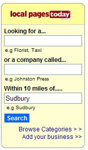
On the Suffolk Free Press website, there is a section called "local pages today" where you can type in the name or type of business in a specific area to find the service that is needed. This attracts another section of an audience, if you need to find a service, people may know that the Suffolk Free Press offer this.
The stories on every website that I have looked into, they are up to date by by the day exactly, or the previous day, depending on how far into the website one looks for a story. If you want tto search a story, then they will be older, seeing as the story was written when the event occured. For my website, after realising that real newspaper websites are being constantly updated with new stories, I am going to post-date the stories that I write so that they are all one date or around the same date. The stories on the home page will all be dated the same, so that it appears they are as up to date as possible. The home page of a newspaper should have the most recent stories on.
Research into Local Newspaper's Websites - The Halstead Gazette
Although the newspaper seems to have a target market of the retired or the unemployed, having a website appeals to the younger generation. The wesbite seems to have a recurring colour scheme, blue/grey/teal & red. Red, being the recognisable colour of the newspaper, contrasts with the blues & teals of the links and headings on parts of the site. The website also includes date and time, I was considering using this in my website as it would be helpful to the readers.

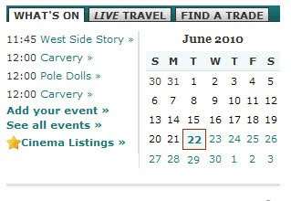 This calender is on the home page, it shows events happening through out the month in the local area, similar to how the front page of the news paper conveys a target audience, showing specific events on their website that would appeal to their target market in the same way the adverts do in the newspaper.
 The printscreen above widens the choice and target market of the newspaper. This section is at the very bottom of the Halstead Gazette's homepage. It highlights a younger adult target audience as it offers jobs, dating oppurtunities, home and cars. Although this could also be aimed at an older audience who are searching for new jobs, homes and cars.
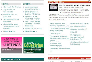
The section above shows more sections of the website that convey a wider target audience, showing links leading to a sports page. It also links to a page/section where the readers can buy and sell unwanted items. There are also two sections and links to 'National News' and 'Your Say'. National News allows readers to widen their knowledge on what is happening around the world aswell as in their local area. The Your Say section allows readers to talk about their views and opinions on stories and what is happening. Having the headings in different coloured frames highlights the differences in the sections and equally attracts attention to each section. This almost ensures that each section is looked at, which in turn helps people who are perhaps looking for something in particular, to find it. Adverts are used here aswell as other sections of the website, to advertise other sections of their own website, for example television listings, which covers another section of media, which also introduces more range and variation in the audience/target market.
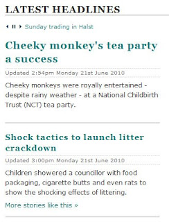
The print screen above demonstrates the most recent top headlines in the newspaper. It gives the reader a small, interesting opening of the story to intrigue them into reading more, or even more stories like that. Having the headlines in a contrasting blue/teal font draws attention to each headline and link. Having the title 'Latest Headlines' in bold capitals, similarly draws attention to this specific section of the webpage. Just below this title, it has sentances of information scrolling across the page, which individually draws the reader toward this section.
Establishing a difference of a local newspaper and a national newspaper
The Daily Telegraph is a national paper, a broadsheet. This newspaper is a lot larger than all of the local newspapers I have studied, it is twice the size. This newspaper has a fairly specifiic target audience, it tends to be higher class people and businessmen, as many of it's articles are business focused. This newspaper also offers freebees, as advertised at the top; "FREE CD". The audience of this newspaper are not for a specific area, as shown by now location in the name of the paper. 'The Daily Telegraph' is written in extremely large font, bigger than that I've seen in local newspapers, it is also completely centered beneath the advertisement at the top. Beneath 'The Daily Telegraph', 'NEWSPAPER OF THE YEAR' is written. this attracts readers to the newspaper. If a newspaper was nominated this, then they would want people to know this, therefore encouraging them to buy and read it. The price is also a lot higher than the local newspapers that I have looked at. Most local newspapers that I have seen are around 40 or 50p, where as this is at £1. This also conveys the target market of the newspaper.
On the front page alone, there are five articles, one main titled 'Petrol Price Rises rake in extra £2bn for Treasury'. I have not come across any local newspapers that have any more than 2 articles on the first page. This gives readers a lot more variation on what to read on the front page and gives them a vaig idea on what to expect through out the rest of the newspaper. Suprisingly, there is only one photograph on the first page (exluding adverts and pictures not related to the articles.) And this photograph is actually relevant to an article on page 9. As it obviously doesn't relate to any of the articles surrounding it, people would be attracted to find out why that photograph is there, then reading the caption and very brief description of the article. But, there is also a small comic drawing relating to the main headliner, this shows the reader a variation in the newspaper.
The advert at the bottom of the page is for a national holiday company: Sandals. It advertises an offer to the readers: a discount for a holiday. Sandals is a fairly high class and expensive holiday resort, therefore emphasising the target audience to be richer and higher class. There are photographs in this advertisement, they show the high standard that Sandals offer; again, emphasising the target market.
The layout of this newspaper is almost completely different to the local newspapers that I have looked out. An example of this is the contents column, actually becoming a row along the bottom of the page, just above the Sandals advertisement. All of these articles that are mentioned in the contents section have a photograph, this attracts more readers, especially as they are in colour.

91% of readers are C1, C 2, D, E
58% of readers are male
Research into Local Newspapers: The East Anglian
Name of Paper
The name of the paper is 'The East Anglian Daily Times'. Being centered at the top of the page, in bold, black capitals. This is similarly set out to The Haverhill Weekly News. Apart from the area being in larger font, and 'Daily Times' is written in a smaller font, beneath this. The website address is written next to 'Daily Times', in red. This draws attention to it and immediately tells the reader that they can go online for updated stories. The date is displayed beneath the title of the news paper, to the left. At the opposite end of the line, 55p, along with the issue number.
Layout
The layout of the front page is fairly simple, like the others that I have looked at. There is one main photograph almost in the centre of the page. There are two adverts on the page. Both the same rectangular shape, one at the top, beneath the name of the paper. And the other at the very bottom of the page. The first advert is for a new national film coming out. The second is for a local/ East Anglian based recycling company. There is also a contents column down the right side of the page, like in many onther papers that I have seen.
Photographs
The biggest photograph is for the main article. This is printed in colour and is a close up of a girl who is part of the article. There are two more photos in the contents column that relate to the stories mentioned. The other photographs are part of the adverts.
Articles
There is only one article on the front page. But there are other article headlines written in the contents column on the right side of the page. The article that is written on the front page is incomplete and it continues onto page 4. This would encourage the reader to flick through to this and therefore more encouraged to buy the newspaper and read other articles.
Advertisements
There are two adverts on the front page. One of them is for a section of the paper, which is advertising a new film coming out, nationally. This is also printed in colour, and the two characters who are part of the advert have been cut out and overlap the name of the paper. This draws attention to and from the advert and the name of the paper.
The second advert is for 'Sackers Recycling'. This is an East Anglian based recycling group. Almost the whole advert is coloured with green. The red text contrasts from the green images and other text, drawing emphasis to one another.
Page 2
Wednesday, 23 June 2010
Research into Local Newspapers: The Haverhill Weekly News

The name of the paper is the 'Haverhill Weekly News'. The way that the name is set out is slightly different to the others that I have looked at. This is the only newspaper that has the area that the newspaper is based in a smaller font than the name of the paper. Despite this, 'Haverhill' still has a reasonable amount of attention drawn to it. This is because it is centred above 'WEEKLY NEWS'. 'WEEKLY NEWS' is written in two different colours. Blue and grey. The blue 'weekly' stands out a lot more than the grey 'news'. The attention is initially drawn to this, and then to 'Haverhill' and 'news'
Layout
The layout of the page is fairly simple. It is set out fairly mirrored and parallel; the size and shape of the box that the name of the paper is set out, is parallel to the way that the advert is set out at the bottom of the page.
Content
On the right hand side of the paper, there is a fairly narrow column that shows the reader what the rest of the newspaper includes. Similarly to the Halstead Gazette, this gives allows the reader to know whether or not the articles that the paper includes would interest the reader, and they do not have to flick through the paper to be able to do this.
Advertisements
The advertisements on the front page are fairly limited when it comes to this newspaper, unlike others that I have looked at, there is only one advert filling the width of the page, at the bottom. This advert is for a local Property Service, 'CXG Property Services' This advert is on a written plain red background. This is the only red on the page, this makes it very bold and it stands out. The writing is mostly in white, which stands out against the red background. Facebook and Twitter logos are also shown in the bottom left hand corner of the advert, this draw more attention to the advert because it draws in a much larger audience as in total, there are 600million people who use Facebook.
Photographs
There are only two photographs on the front page. one of them is at the top of the page, overlapping 'News'. This draws attention to the headline that the picture relates to. The second of the photographs is for one of the articles on the front page. This is in colour and shows all of the people involved in the article.
Articles
There are two articles on the front page. One of them has a photo, and one of them doesn't. In my opinion, this looks better than having lots of photos, one for each article, as it may look fairly cluttered with all of the other images on the page. The first story that appears on the front page (to the left of the photograph) is the story that links to the bold headline. This is about Haverhill's Crown Health Centre. The article next to this one is outlined by a black box, this shows that there are two different articles on the front page. This article is also written in a different font, again highlighting that it is a second article. This has a smaller head line than the one that it continued onto page 3.
There are also other headlines on the page, just above the main headline. These are written in two different colours, and one is written in capitals. This draws individual attention to each headline, again allowing the readers to see if the articles would interest them.
Page 2
There are four articles on the second page. 3 of them are fairly small and they all fit into one column half the size of the page. The main article almost fills up half of the page. and there are three photographs that relate to this article. The main article is about local businesses. This would be a fairly universal topic for readers to engage in, seeing as small towns are usually interested in what their own people have to offer in terms of business, rather than supporting huge businesses that they don't really have any connection with. The large photograph at the top of the page is of ten people who have their own businesses in the local area of Haverhill. They are all named in a caption on the right side of the page.
There is a second photograph for this article, which is a photograph of a man who won the business of the year award. The third photograph is of a woman who competed in The Apprentice, she hosted these awards.
There is one advertisement on this page, but compared to others that I have looked at, it is fairly big. It is an advert for a local pub, in Haverhill. It also shows the forthcoming events in the pub, along with a photograph of someone that I assume played in the pub recently.
Tuesday, 22 June 2010
Research into Local Newspapers - The Suffolk Free Press
Name of Paper
Similar to the Halstead Gazette, The Suffolk Free Press immediatly recognises the area that the news paper is based. Although compared to the Halstead Gazette, The Suffolk Free Press covers a wider area, a county, rather than just a town. 'Free Press' is written in blue font, and is larger than 'Suffolk' and all of the other texts on the page, except the main article title. Like the Halstead Gazette, The Suffolk Free Press is being sold on a weekday, Thurdsday.
Content
A competition is shown at the top of the page, advertising the chance to win a new IPad. The text 'Win an IPad in our competition ' is orange font on a blue background, using contrasting colours atttracts more attention to this section of the newspaper. This could also attract a younger audience into reading the newspaper, or winning the competition. Next to this, there is also a chance to win tickets to a Jools Holland concert, this conveys a more mature audience. Jools Holland is an English Pianist, this represents an older range of readers, which levels out the younger range conveyed by the chance to win an IPad. Homes are also advertised in this newspaper, this is shown in white font on a blue strip, so the readers know where the homes for sale are is that is what they are looking for in particular.
Main Article
The main article is about a local citizen being wrongly accused (by the council) of benefit fraud, and the council are now accused of wasting tax payers money. This appeals to a local audience, seeing as it concerns their local council. Journalists have the right to portray and tell their readers what their council has done or is doing, along with other occurances that affect opinions & trust of the public.
Advertisements
There are only two advertisements on the Suffolk Free Press' front page. The main advert is for an opticians in Sudbury, at the bottom of the page. The photograph for this advert includes a young/middle-aged male - wearing transition glasses, this conveys a fairly middle-age reader audience. This advert includes logos, colours (mainly purple and orange). 'Free' is also written in large capital letters, this is a very typical way to present the word 'free' in an advertisement, it draws a large audience as almost everyone wants a bargain, especially on life's necessities.
The other advertisement is for a local car service, this covers a very large audience seeing as 45.6 million people in the UK can drive.
Photographs
The photographs used on the front cover of the Suffolk Free Press include an IPad, as part of a competition advert, as I have previously wrote about in the content section above. The photograph of the front page article is a photograph of the woman included in the article and her friend, they appear to be outside one of their front doors.The last photograph is on the opticians advert. All of the photos are in colour ink, this often draws in more attention to a newspaper when people are searching through newspapers.
Page 2 
Monday, 21 June 2010
Research into Local Newspapers - Halstead Gazette

There are two advertisements on pubs. Another about stair lifts and another advertising a local opticians. These all convey an older target market for the newspaper, possibly retired.

Wednesday, 16 June 2010
Initial Ideas
Questions that I am asking myself:
1. Do I base my main/front page article on a real life event or a story that I have made up?
2. Do I create a newspaper for an area that already has a local paper or an area that doesn't?
3. Will creating a newspaper in the same area as another create too many similarities between the papers?
4. What will the name of my newspaper be and where will it be based ?
5. What sort of articles make the first two pages of a local newspaper?
6.How many photographs and pictures on average are included on the first two pages of a newspaper?
7. Should I have a contents section on my front page/'what's inside'
8. What else should I include on my front page?
9. What will I base the poster on?
10. What two sections of a newspaper are most popular and should I use these two sections for the two hyperlinked pages?
11. Should I use colour on my pages? Or should they be printed in black and white ink?
12. Where is a suitable, local area that I can base/set my local newspaper?
13. What programme should I use to create my webpage and hyperlinked pages?
Answering my questions:
1. Basing my main/front page article on a real life event would mean that I could gain sufficient details and photographs to create a detailed and realistic story, although resources may lack truth and details that I could write about, that hadn't already been written in another local newspaper. Writing a story/article that's based around the same event, may cause me to lack unique details that other papers also include, where as a story/article that I have made up, I can create unique details to a story that can be alot more dramatised compared to a real article, therefore being a more interesting story with an individual atmosphere. I would also be able to use more expressive language and be more creative in what my main story would be based on and the details within it.
2 & 3. If I were to create another local newspaper for an area that already has their own newspaper, limitations may be created to what I can call my newspaper. There may also be obvious similarities between my newspaper and the paper set in the same area. It may also have an influence on how I write my newspaper and how I lay it out. Where as if I chose to base my local newspaper on an area that doesn't have it's own newspaper, I would have a larger variation on what I can call my paper. I could create a more individual newspaper without a large influence from a paper set in the same local area.
5. The most dramatic or emotional articles usually make it onto the first two pages of the newspapers that I have looked at. The type of stories on the first two pages have varied from paper to paper. I think that depending on what kind of target audience that the newspaper has, the front page & second page articles fit that target audience more. On the first & second pages of national newspapers like The Sun, the stories that are included on the front page are often just a short briefing of the actual story. It also then says 'Go to page X to read more' this encourages the reader to either buy the newspaper or flick through the newspaper and become interested in what the other stories contain. When it comes to papers like The Sun, the stories on the first two pages are what their target audience would be most interested in, for example celebrity gossip. Where as local newspapers have a lot more variation in the type of stories that make the first two pages, for example plans that the local council have.
6. The photographs on the papers' front pages that I have studied are a main attraction to the paper - I assume the bigger the photograph, and the more detailed and unique the photograph is to the individual paper, brings more attention to it along with more purchases.
Adverts also tend to take up a fair amount of room on the front page - I assume these are used on the front page to attract attention from the specific target audience. For example, the Halstead Gazette has four adverts: two of them are advertising local pubs, one is advertising an optician and the last is advertising a stair lift. This shows that the main target audience could be retired and old age pensioners.
7. After research into front pages of newspapers, I have swayed more to the idea of having a section on my front page informing the reader of what other articles are included in the newspaper. It also allows me to aim my newspaper more toward a specific target audience.
8. My initial ideas for what else I should include on my front page:
- A content section
-Coloured photographs, images and photographs
- Weather Forecast
- More than one story
- Other headlines
9. First, I struggled to think of ideas for what I could create a poster for the newspaper on:
- I could advertise the paper coming out
- I could advertise the paper through a subscription
- I could generally advertise the paper and what it is about, attracting a certain target audience.
10. In many newspapers that I have looked at, both national and local, there are often even a seperate magazine or extra booklet that includes information on sports news. This is why I have decided to make a hyper-linked page for 'Sports News'. Other than having sports pages, local newspapers also tend to have extra sections or booklets on housing. Despite this being a fairly easy option to create as a hyperlinked page on 'Local News'. This means I am more able to be creative on what I use on the page and how I write the stories/articles.
11. After studying local newspapers, I found that colour ink is more attractive and appealing. All of the local papers that I have looked at are printed in coloured ink. The use of red and blue ink is also common in the name of the news paper, for example on the Halstead Gazette, 'Gazette' is written in a red font.
12. After reading through county based and town based newspapers, I have found that I am much more interested in what a county newspaper contains. It has a larger variation of articles as it is based on what is happening all over the county, not just what is happening in and around a local town. This is why I have chosen to create a newspaper that is county based. As I live on the border of Essex and Suffolk, I would have to chose one or the other. This means I have to have more knowledge and have better access to the area. I have chosen to base my newspaper on Essex as I live in Essex, and my Sixth form is also in Essex, therefore giving me more access to Essex than I would have Suffolk, despite having most of my family members in Suffolk.
13. After comparing Piczo, Moonfruit and Webs, I have decided to use Piczo to create my news paper's website. I chose Piczo.com as I found it easy to design creative webpages, in the style that I want. There are no restrictions of how I design and chose the lay out.


