Friday, 2 July 2010

Comparing & Evaluating Website Designing Programmes


This programme is called 'Webs', above is the home page.
Webs gave me a variation of categories that I could choose from before creating my website, shown above, I would have chosen small business/proffessional, but it isn't free, unlike other website programmes, so I chose to use 'Local' as it would be for a local newspaper.
Above, I have printscreened the choices that Webs has given me for the layout and presentation of my website. For a newspaper website, I would need to choose a proffessional looking website layout, but not too boring, so I am stuck on which layout to choose.


I am now looking at creating a website on Piczo. Above is the tool bar for creating a website, there are not very many choices for this.
Above I have printscreened the page that is created once a website has been created. It is just a blank page and would mean that I have to start from absolute scratch, including the layout of the page, which would be fairly time consuming.Above I have printscreened the options that the tool bar offers. I feel that Piczo isn't proffessional enough to create a website for a local newspaper and it doesn't offer enough variation and there isn't anything particularly special and outstanding about it.


Moonfruit.com offers different types of websites and templates depending on what type of website was needed to be created. Although it doesn't seem to offer a template thast suits what I need to create my two hyperlinked pages. Although the printscreen below is a template under the 'Professional' tab; 'Metropolitan'. It appealed to me to be a website for my local newspaper as it seems professional and it allows me to add photographs, which would be good for my newspaper and allowing an insight to the stories and articles in my newspaper.


Moonfruit.com allows me to edit my pages, but editing is fairly restricted and limited to what I can change about the website, for example it doesn't allow me to add or remove hyperlinks, or even change the name of each link. I also can not change the layout of the website pages to what the template offers. This restricts my creativity on my website's appearence. The printscreen below demonstrates the possible actions I can make to change and differ my website pages.


Overall, I have chosen to use Moonfruit.com. I have chosen this because unlike Piczo, it helps create a more professional looking website, where as I have found that Piczo is tended more for a younger, unprofessional user. I initially started to use piczo to create my site and got as far as part of the home page, until I realised that it would not allow me to look as professional as I was hoping so I used Moonfruit.com knowing that I could get my website to look the standard I wanted.

Thursday, 1 July 2010

Logo Ideas and Inspiration

The logos that I have looked at for local newspapers tend to consist of similar conventions:
1. Black font is used for the area
2. Coloured font is also used, usually red
3. The area is written in smaller font than the title of the paper
4. The area that the newspaper is based comes first
5. Most of the logos have words in capital letters (except the Haverhill echo)
The following images are of the logos that newspapers have local to me:


All of the above newspaper logos are fairly similar when it comes to font, it is all very easy to read and the area where the newspaper is based is always in a smaller font than the name of the paper, e.g. 'Gazette' or 'Times'.
The following images are images that I have created using a program called GIMP (Generation Image Manipulation Program), I have looked at and studied fonts and presentation of the logos that local and national newspaper have, and I have taken what I have found out into consideration when I created the following images:
The image above is my first idea. I was influenced to create this one by the Suffolk Free Press' logo. For this, I have used a very similar font along with a fairly similar lay out. I decided against using blue in any of my ideas because I felt that it would appear odd to write the word 'Heart' in any colour that was not red or pink etc. and seeing as pink is not a very suitable colour for the name of a newspaper as it is often conceived to be a stereotypical feminine colour, red would be the best option for me to use.

For the image above, I have used two different fonts. I have also set it out in a similar way to the first with 'The Essex' in a smaller font to 'Heart' and centred between the H and T. This draws attention to both where the newspaper is based, and what the newspaper is called. Despite this, I do not like how the two fonts are used in the same title. I feel that this looks fairly odd.
For the image above, I have chosen to use a more delicate font. I feel that this isn't bold enough to be the title of a newspaper. It would not stand out on a newspaper. I also chose not to write'The Essex' in complete capitals. I feel that this is also not very bold and it does not stand out in the way that I want it to. The image above I have again used two different fonts, but this time, they are more similar. I feel that both fonts are fairly comical and cartoon-like. This isn't appropriate for the newspaper that I want to create.
In this image (above) I chose to use a more serious, blunt and standard font. I do feel that this font is fairly appropriate for the type of newspaper that I want to create. I also like having 'The Essex' lined up with 'Heart', but I think I prefer having 'The Essex' central above 'Heart'.
Despite the things that I like about this idea, I feel that it isn't creative enough for the newspaper that I want to create.
This is my final idea. I have used the same font, but 'Heart' is written in bold and 'The Essex' is not. I feel that this is quite a creative idea, but I'm not very sure about having 'The Essex' the same size as 'Heart'. I feel that it looks a lot better to have either one or the other bolder or bigger than the other. I also overlapped the x and the t for a furthered creative effect. Despite liking this, I feel that it looks slightly unproffessional and like I did it by accident.

Despite the fact that I prefer my first idea, I have decided to ask others which they prefer.

These are the results that I received in a table that I made in Microsoft Word:


This backs up my choice of the first style, so this will be the one that I use on my website and my newspaper.

Questionnaire - Which of the following fonts would suit the name of a local newspaper called 'The Essex Heart'?

After my first questionnaire and the result and my preference of 'The Essex Heart' being most popular. These fonts are the fonts that I have chosen to ask my target market which one that they prefer.

1. I felt that this font looks good, but I don't think that it is a font that would be seen and noticed on the front page of a newspaper, shown through how none of the newspaper names have been in a narrow font.

2. Out of all of the fonts, this is my favourite, it's big and bold enough to stand out on the front page of a newspaper. This is also a similar font to that of the Suffolk Free Press. 3. I think that this font, similarly to font #1 is not bold enough to stand out on the front page of my newspaper, or any newspaper that I have seen.
4. Despite this font being bold enough to stand out on the front page of a newspaper, I feel that it is too plain and too square to fit onto my front page.
5. In my opinion, this font it far too creative and artistic for the front page of a newspaper.
6. This font is similarly too creative and different to fonts that are usually used for the name of a newspaper.
7. I like this font because it is fairly different to the other fonts that I have found, it is also fairly bold I could imagine that it would stand out on the front page of a newspaper. The only down side to using this font is that it may not be as bold as others that I have found.

Wednesday, 30 June 2010

After Looking at Websites...

After researching into other news websites, it has helped me realise that there are quite a lot of differences between that and a newspaper website. Other news websites tend to highlight the top headlines, where as newspaper websites tend to show a huge variation of news stories, big and small.
BBC Essex is one of the most unique news website, as it has numerous sections dedicated to listening, watching and reading. This website also has a weather forecast for the area. I would like to recreate this for my website.
Local paper websites made me realise that there are often many adverts, pictures and photographs, especially on the homepage. This is what I would also like to recreate on my website. Many websites, for example the Halstead Gazette, have small marquees at the top of the web page that have the most updated news stories that readers are able to click on and read the stories. After looking into how to recreate this on my website, I have found various places where I can copy and paste a HTML link so that I can create a marquee on my website. But this marquee can not be updated, it can only be a constant stream of the same words over and over, so I could make it look like a link to a page, and tell the readers to click on this to take them to a certain page, for example the month's top stories.
Overall, I feel that it would be more unique to recreate some of the things that I have seen on other news websites. But to create a realistic newspaper website, I would need to limit these aspects to a point where it would be realistic to see them on a newspaper website.

Looking into Other News: Thisistotalessex

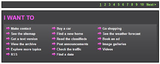
This is Total Essex tends to get it's stories from newspaper websites in Essex. It seems to colaberate all of the top stories and put them onto it's own website. The prinscreen above is the main menu, which is located at the top of the page. It has the main links written in grey on a white background, and then beneath each, when hovered over, appears a grey box with white writing that includes sub links related to the topic that is being hovered over. There is also an option to 'login/register', along with a search bar, a brief weather forecast and various hyperlinked logos to their website.

The printscreen above is a section at the top of the page that tells the readers the main stories that are on the website. Each of these headlines have the area that is affected by the story. These places are written in capital letters, this draws attention to them and immediately lets the reader know whether the story will affect them. Despite there only being one photograph in this section, it is a fairly large photo and it takes up 1/4 of the section. It also has the beginning of the article written beneath it, this gives readers more information about the article, instead of just the title.
This printscreen is on the right side of the page. It shows three different aspects that the website offers. It gives readers the oppurtunity to look at homes for sale, cars for sale and to look for a local business. The first to show photographs, this gives readers the insight to what kind of car or house may be advertised for sale on the page.

The printscreen above shows a section on the page that is located toward the bottom of the page. It allows the reader to view what the website offers in one section. this makes searching for something a lot easier as it will take the reader to where they want to go in one click.


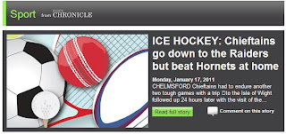
This printscreen is an example of the different parts of the website. This shows that there is a page for sports, and this is shown on the home page that takes you to the sports page, and to continue reading the article that is written on the right side of the picture. The picture makes it obvious that it leads to the sports page, along with the heading.


Tuesday, 29 June 2010

Looking into Other News: Google


'Google news' has the same logo as the general search engine 'Google', it is even initially set out in the same way as the Google search engine home page is, like the printscreen above.


The printscreen to the left is of the search engine tool bar at the bottom of the page, there is also an option to go the the 'U.S Edition', to find out news that is going on in the USA, there are also links to other pages that Google offer, for example pages that include information about Google in particular.


The page includes many different heading of different types of news, this includes Business, Sci/Tech, U.K, World and Local News, all shown in the printscreens on the left and below.
All of the dedicated sections have two small images that both of the stories are linked to,this gives the reader a better insight of the story and perhaps adds a higher level of interest to each story. The heading on each section is also a link, this allows the reader to read more articles about which ever subject they are interested in.
There is also an option to minimize or close a section, so if the reader is not interested in a specific topic, they can get rid of or hide it. This is done by selecting either the small arrow in a box or the small cross in a box in the top right of each section.

Beneath each article heading, there is the name of the website that the piece of news was received from, this is in pale grey writing, so that it doesn't take any attention away from the bold navy headline. Some of the articles also have the names of the people who wrote the story in underlined grey font. The amount of time ago that the story was added to the page is also present on each story, along the same line that the name of the website that the article belongs to.
Beneath this, the first five or so lines of the article are shown, this gives readers the opportunity to decide whether or not the story interests them.
There is also a link to a story that is similar to the one that is previewed, also with the name of the website that initially had it. There is also a small list of other websites that have reported the same or a similar story.

This section is a search tool bar, the reader types in the name of the place where they live or their post code, and it comes up with a section, presented like the rest, of articles that are based in their local area.


This section is on the left side of the page, toward the middle/bottom of the page, it has a list of all the different sections and types of stories that the website includes, these are also all spread out across the page, as shown in the printscreens above. It is also possible to click a link that shows the reader all of the latest headlines, and another link that allows the reader to view all of the photographs & images related to the articles.


Monday, 28 June 2010

Looking into Other News: NewsNow


This website that I have been looking at and studying is called 'NewsNow', this website gathers stories from newspaper websites and collects all the most recent stories as soon as they've been written online, and then update their website with this. This is their logo, which appears at the top right corner of the website page.
Similar to other news websites that I have researched, NewsNow includes a range of stories that are set out in sections on the home page, to the left, I have printscreened various sections from the homepage.
Each section is recognised by a different colour,
and the name of each section is written in white, this draws attention to the this highlights each type of articlessection individually.
Each section has four headlines included, and these headlines have a small flag to the left side of them, this allows the reader to know which country the affects/is based in, all of the stories on the home page are either based in the USA or the UK.
Each of the sections have a link that allows the reader to read stories that are also related to the genre; 'more'. All of these stories on each section have the name of the paper that initially wrote the story, and then it is followed by the time is was added to the website. This is in light grey writing, compared to the black headline writing, the headline is drawn out.
This section, on the left, is also on the homepage. This shows article headlines that the website itself has written, this includes the date and time beneath the headline in a lighter grey font for the same reason as the other sections.
Each Headline is a link to the story, this allows more space on the home page for other headlines and other information.
There is also an option to subscribe to the stories that NewsNow write, the reader can subscribe by email, twitter or RSS feed.


NewsNow has an image on the left side of the home page toward the middle of the page, this is one of the brightest images on the page, and it tells the reader that they have been nominated and won the "Website of the year", this gives the readers confidence in the website. Beneath, it also reads "Thanks to everyone who voted!" this gives the reader a feeling of involvement toward the website.